Stay Alive Case study
1 July 2025
UX Designer/Researcher (Solo Project)
Warning: While there is no explicit information and I have attempted to ensure any triggering content is minimal, some people may find the following subject triggering for mention of suicide.
Redesigning the stay alive suicide prevention app, taking off one extra stress when getting support in a crisis.
Making the Stay Alive suicide prevention app calmer and clearer — when every second counts.

Summary (speed-read approved)
I redesigned the Stay Alive suicide prevention app to reduce stress for users in crisis. Guerrilla testing revealed four key pain points: unclear iconography, saving issues, hidden features, and confusing interactions. To combat this I proposed accessible, user-centred design changes that better support people when they need it most.
The Challenge
Stay Alive is a UK-based suicide prevention app created by Grassroots Suicide Prevention. It offers essential features like safety planning, breathing tools, wellness support, and crisis helplines. However, usability testing and secondary research revealed that several of its most critical features were hard to find or interact with — a major concern for users in crisis.
The app needed to remain calm and visually non-intrusive, while becoming more intuitive, accessible, and supportive in moments of cognitive overload.
Goals
-
Improve usability of core crisis tools
-
Reduce friction and confusion
-
Enhance accessibility for neurodivergent users and those in distress
Constraints
-
Maintain the app’s calm, minimal visual tone
-
Design for a wide range of user needs to combat high-stress environments
Original Designs
Research
I approached this project using:
Research Methods
-
Guerrilla usability testing with 3 participants
-
User review analysis
-
Testimonial and support forum analysis
-
Academic literature, including accessibility and suicide prevention design studies
Before conducting interviews, I considered the sensitivity of the app’s topic. I was transparent about its content when recruiting, ensured participants gave informed consent, and avoided triggering language. Each session began with a briefing on potentially sensitive topics, a second round of consent, and a check-in about language or areas to avoid. Participants were reminded they could skip questions or stop at any time.
Key Insights
-
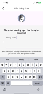
Users found the Safety Plan icon confusing, interpreting it as statistics
-
Save functions were not clearly visible, resulting in lost work
-
Navigation to key features like "My Stay Alive" felt hidden
-
Users wanted calming features like guided meditations
-
Tick box inputs were unintuitive and caused frustration
Research Images
 |  |
|---|---|
 |  |
 |  |
Strategy
My goal was to simplify interaction without overwhelming the user. This meant:
-
Mapping common user flows during moments of distress
-
Applying UX heuristics like recognition over recall, visibility of system status, and user control
-
Prioritising elements that reduce cognitive load and create a sense of safety
Design Process
I made targeted design recommendations for four main issues:
1. Safety Plan Icon Redesign
Before : Looked like a stats graph — misleading in crisis
After : Replaced with a hard hat, which users associated with protection and safety
2. Clearer Save Button
Before : Users didn't realise they had to manually save
After : Added a persistent sticky “Save” button for visibility
3. Tick Box Confusion
Before : Ticks only worked in edit mode, causing frustration
After : Introduced an interactive collage interface with pre-filled or user-created reason cards
4. Meditation Feature
Before : Not present, but repeatedly requested
After : Added simple, optional guided meditations beside the breathing tool
Low-fi Wireframe

Mid-Fidelity Wireframe
High-Fidelity Designs

Impact and Takeaways (no not the deliveroo kind sadly)
Testing involved three participants completing common tasks.
Feedback directly shaped:
-
Icon choice and save function placement
-
Interaction designs for "Reasons to Live"
-
Placement of meditation alongside breathing
What I’d do next:
-
Retest the improved design features (I was unable to do this due to a time constraint of one week during my course).
-
Implement auto-save
-
Do a design overhaul of the colours and a more high fid prototype
This case taught me how vital clarity, recognition, and emotional safety are in design for crisis. When cognitive function is reduced, small usability blocks can prevent life-saving support. On seeing my case study on their app, Grassroots actually reached out and requested to discuss further on how we could work together to improve the Stay Alive app, which I work on with them as volunteer work now.
Next Steps
I’d conduct more rounds of testing, and, if volunteers were comfortable, record if they had experience that made them feel this was applicable to them or not.
Tools Used


.png)
.png)

